This article provides examples about plotting line chart using pandas.DataFrame.plot function.
Prerequisites
The data I'm going to use is the same as the other article Pandas DataFrame Plot - Bar Chart. I'm also using Jupyter Notebook to plot them.
The DataFrame has 9 records:
| DATE | TYPE | SALES |
|---|---|---|
| 0 | 2020-01-01 | TypeA |
| --- | --- | --- |
| 1 | 2020-01-01 | TypeB |
| --- | --- | --- |
| 2 | 2020-01-01 | TypeC |
| --- | --- | --- |
| 3 | 2020-02-01 | TypeA |
| --- | --- | --- |
| 4 | 2020-02-01 | TypeB |
| --- | --- | --- |
| 5 | 2020-02-01 | TypeC |
| --- | --- | --- |
| 6 | 2020-03-01 | TypeA |
| --- | --- | --- |
| 7 | 2020-03-01 | TypeB |
| --- | --- | --- |
| 8 | 2020-03-01 | TypeC |
| --- | --- | --- |
Line chart plot
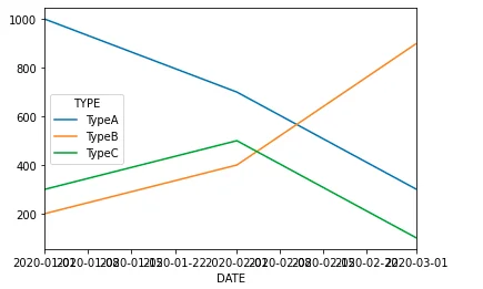
df.groupby(['DATE','TYPE']).sum().unstack().plot(kind='line',y='SALES')
The output of the plotting:
Change marker
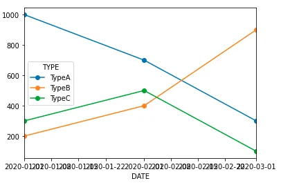
The following code snippet changes marker to circle. Refer to matplotlib documentation about all the options you could choose.
df.groupby(['DATE','TYPE']).sum().unstack().plot(kind='line',y='SALES', marker='o')
Cumulative line chart
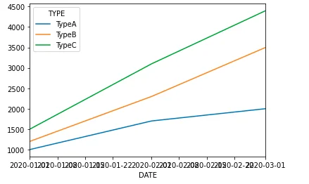
Similar as the bar chart plotting, we can also plot a cumulative line chart.
df.groupby(['DATE','TYPE']).sum().groupby(level=[1]).cumsum().unstack().plot(kind='line',y='SALES', stacked = True)
X-axis labels
In the above charts, X-axis labels are very crowded. There are multiple ways to fix it. One of the approaches is to use formatter and also set major locator.
The code snippet looks like the following
import matplotlib
import matplotlib.dates as mdates
from matplotlib.dates import DateFormatter

df_unstack = df.groupby(['DATE','TYPE']).sum().groupby(level=[1]).cumsum().unstack()
plt =df_unstack.plot(kind='line',y='SALES', marker='o', stacked = True)

date_form = DateFormatter("%Y-%m")
plt.xaxis.set_major_formatter(date_form)
plt.xaxis.set_major_locator(mdates.MonthLocator(interval=1))
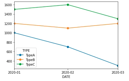
Chart looks like this:
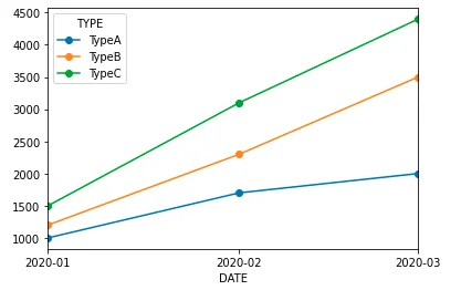
Similarly for the non-cumulative one, you can also set up the major locator:
import matplotlib
import matplotlib.dates as mdates
from matplotlib.dates import DateFormatter

df_unstack = df.groupby(['DATE','TYPE']).sum().unstack()
plt =df_unstack.plot(kind='line',y='SALES', marker='o', stacked = True)

date_form = DateFormatter("%Y-%m")
plt.xaxis.set_major_formatter(date_form)
plt.xaxis.set_major_locator(mdates.MonthLocator(interval=1))
Output looks like the following screenshot:
