For data analyst, it is critical to use charts to tell data stories clearly. R has numerous libraries to create charts and graphs. This article summarizes the high-level R plotting APIs (incl. graphical parameters) and provides examples about plotting Pie Chart, Bar Chart, BoxPlot, Histogram, Line and Scatterplot using R.
Device, screen and layout
Before plotting, it is important to understand R's
| Category | Functions |
|---|---|
| Graphical devices | These APIs provide controls over multiple graphics devices: dev.list(), dev.cur(), dev.set(number), dev.off() |
| Screens | These APIs can be used to define a number of regions within the current device which can, to some extent, be treated as separate graphics devices. It is useful for generating multiple plots on a single device. split.screen, screen(n), erase.screen() * cannot work with multiple graphic device |
| Layouts (not compatible with split.screen) | layout divides the device up into as many rows and columns as there are in matrix mat, with the column-widths and the row-heights specified in the respective arguments. layout(matrix), layout.show(n) |
Examples
The following are some code examples (script R26.GraphicDevices.R) using these APIs:
# list devices
dev.list()
dev.set(3)
dev.cur()
dev.off()
dev.list()

#window
windows()
png()
dev.list()
dev.set(3)
dev.off(2)

# split screen
split.screen(c(1, 2))
screen(1)
screen(2)

# layout
layout(matrix(1:4, 2, 2))
layout.show(4)
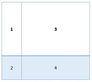
For example, the following code snippet will split the screen into 4 regions:
layout(matrix(1:4,2,2), widths=c(1, 3),heights=c(3, 1))
Graphic functions
The following table summarizes R graphic functions that can be used in plotting:
| Function | Description |
|---|---|
| plot(x) | lot of the values of x (on the y-axis) ordered on the x-axis |
| plot(x, y) | bivariate plot of x (on the x-axis) and y (on the y-axis) |
| sunflowerplot(x, y) | the points with similar coordinates are drawn as a flower which petal number represents the number of points |
| pie(x) | circular pie-chart |
| boxplot(x) | “box-and-whiskers” plot |
| stripchart(x) | plot of the values of x on a line (an alternative to boxplot() for small sample sizes) |
| coplot(x~y | z) |
| interaction.plot (f1, f2, y) | (f1, f2, y) |
| if f1 and f2 are factors, plots the means of y (on the y-axis) with respect to the values of f1 (on the x-axis) and of f2 (different curves); the option fun allows to choose the summary statistic of y (by default fun=mean) |
|
| matplot(x,y) | bivariate plot of the first column of x vs. the first one of y, the second one of x vs. the second one of y, etc. |
| dotchart(x) | if x is a data frame, plots a Cleveland dot plot (stacked plots line-by-line and column-by-column) |
| fourfoldplot(x) | visualizes, with quarters of circles, the association between two dichotomous variables for different populations (x must be an array with dim=c(2, 2, k), or a matrix with dim=c(2, 2) if k = 1) |
| assocplot(x) | Cohen–Friendly graph showing the deviations from independence of rows and columns in a two dimensional contingency table |
| mosaicplot(x) | ‘mosaic’ graph of the residuals from a log-linear regression of a contingency table |
| pairs(x) | if x is a matrix or a data frame, draws all possible bivariate plots between the columns of x |
| plot.ts(x) | if x is an object of class "ts", plot of x with respect to time, x may be multivariate but the series must have the same frequency and dates |
| ts.plot(x) | Similar as above but if x is multivariate the series may have different dates and must have the same frequency |
| hist(x) | histogram of the frequencies of x |
| barplot(x) | histogram of the values of x |
| qqnorm(x) | quantiles of x with respect to the values expected under a normal law |
| qqplot(x, y) | quantiles of y with respect to the quantiles of x |
| contour(x, y, z) | contour plot (data are interpolated to draw the curves), x and y must be vectors and z must be a matrix so that dim(z)=c(length(x), length(y)) (x and y may be omitted) |
| filled.contour (x, y, z) | Similar as above but the areas between the contours are coloured, and a legend of the colours is drawn as well |
| image(x, y, z) | Similar as above but the actual data are represented with colours |
| persp(x, y, z) | Similar as above but in perspective |
| stars(x) | if x is a matrix or a data frame, draws a graph with segments or a star where each row of x is represented by a star and the columns are the lengths of the segments |
| symbols(x, y, ...) | draws, at the coordinates given by x and y, symbols (circles, squares, rectangles, stars, thermometers or “boxplots”) which sizes, colours, etc, are specified by supplementary arguments |
| termplot(mod.obj) | plot of the (partial) effects of a regression model (mod.obj) |
Commonalities of graphic functions
There are some common shared parameters for these plotting functions:
- add=FALSE: if TRUE superposes the plot on the previous one (if it exists)
- axes=TRUE: if FALSE does not draw the axes and the box
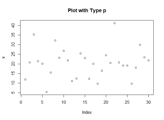
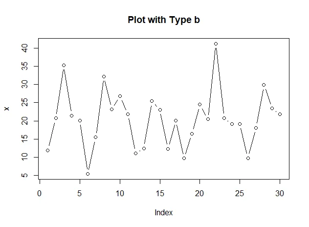
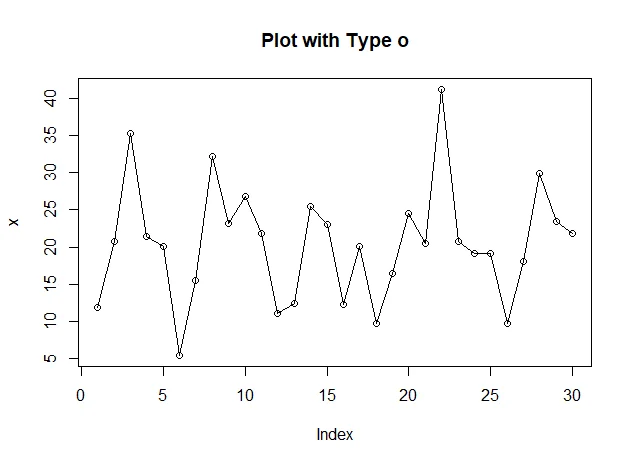
- type="p":
"p": points
"l": lines
"b": points connected by lines
"o": Similar as above but the lines are over the points
"h": vertical lines
"s": steps, the data are represented by the top of the vertical lines
"S": Similar as above but the data are represented by the bottom of the vertical lines
- xlim=, ylim= specifies the lower and upper limits of the axes, for example with xlim=c(1, 10) or xlim=range(x)
- xlab=, ylab= annotates the axes (character vector)
- main= main title (character vector)
- sub= sub-title
Simple examples
The following code snippet shows some basic examples (script R27.GraphicalFunctions.R) using these common parameters:
# plot
x <- rnorm(30,20,10)

plot(x, type="p", main="Plot with Type p", )
plot(x, type="l", main="Plot with Type l", add=FALSE)
plot(x, type="b", main="Plot with Type b", add=FALSE)
plot(x, type="o", main="Plot with Type o", add=FALSE)
plot(x, type="h", main="Plot with Type h", add=FALSE)
plot(x, type="s", main="Plot with Type s", add=FALSE)
par(bg="green")
plot(x, type="S", main="Plot with Type S", add=FALSE)
Outputs:

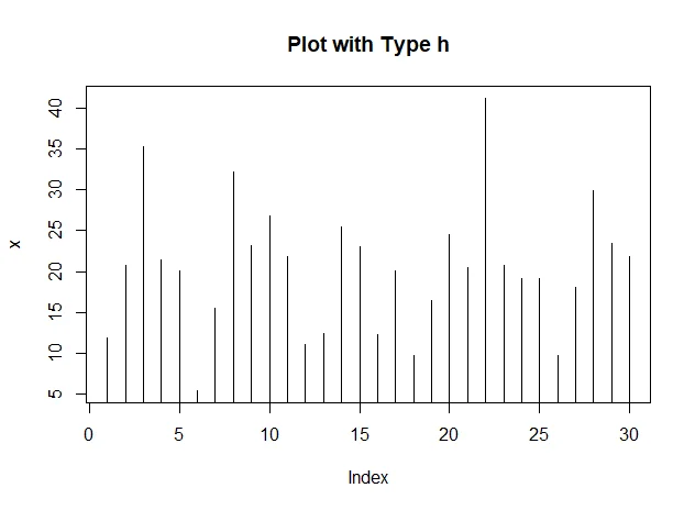
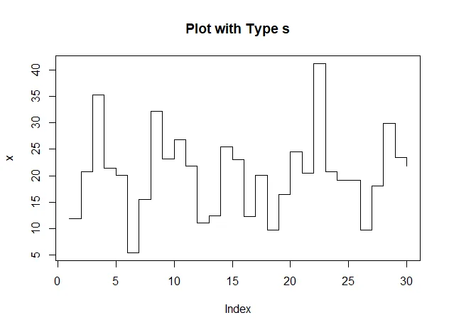
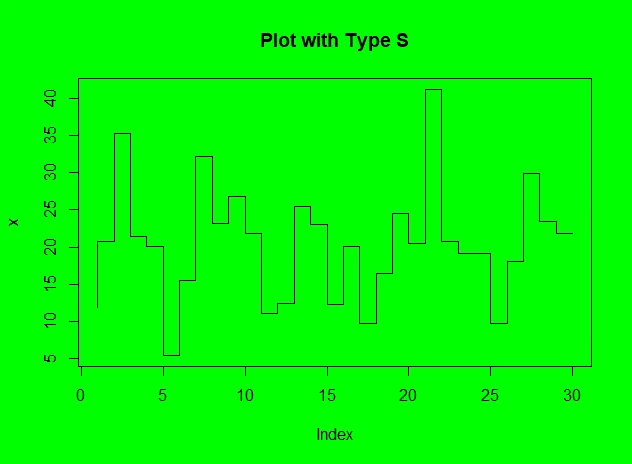
Low level plotting commands
Low level plotting commands are used to affect an existing graph. They can be used to add these items to the graph:
- data labels
- lines and points
- legends
- title, sub title
- …
The following table summarizes all the low-level plotting commands:
| Commands | Description |
|---|---|
| points(x, y) | adds points (the option type= can be used) |
| lines(x, y) | Similar as above but with lines |
| text(x, y, labels, ...) | adds text given by labels at coordinates (x,y); a typical use is: plot(x, y, type="n"); text(x, y, names) |
| mtext(text, side=3, line=0, ...) | adds text given by text in the margin specified by side (see axis() below); line specifies the line from the plotting area |
| segments(x0, y0, x1, y1) | draws lines from points (x0,y0) to points (x1,y1) |
| arrows(x0, y0, x1, y1, angle= 30, code=2) | Same as above with arrows at points (x0,y0) if code=2, at points (x1,y1) if code=1, or both if code=3; angle controls the angle from the shaft of the arrow to the edge of the arrow head |
| abline(a,b) | draws a line of slope b and intercept a |
| abline(h=y) | draws a horizontal line at ordinate y |
| abline(v=x) | draws a vertical line at abcissa x |
| abline(lm.obj) | draws the regression line given by lm.obj |
| rect(x1, y1, x2, y2) | draws a rectangle which left, right, bottom, and top limits are x1, x2, y1, and y2, respectively |
| polygon(x, y) | draws a polygon linking the points with coordinates given by x and y |
| legend(x, y, legend) | adds the legend at the point (x,y) with the symbols given by legend |
| title() | adds a title and optionally a sub-title |
| axis(side, vect) | adds an axis at the bottom (side=1), on the left (2), at the top (3), or on the right (4); vect (optional) gives the abcissa (or ordinates) where tick-marks are drawn |
| box() | adds a box around the current plot |
| rug(x) | draws the data x on the x-axis as small vertical lines |
Graphic parameters
Graphs can be improved using graphical parameters. They can be used either as options of graphical functions or with function par.
For example, the following code snippet will set the device background color as green for all the following plots:
par(bg="green")
In next part, I will show plotting examples of different chart types.