In this article I'm going to show you some examples about plotting scatter and hexbin chart with Pandas DataFrame. I'm using Jupyter Notebook as IDE/code execution environment.
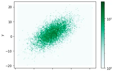
Hexbin chart is a pcolor of a 2-D histogram with hexagonal cell and can be more informative compared with Scatter chart.
Prepare the data
Use the following code snippet to create a Pandas DataFrame object in memory:
import pandas as pd
import numpy as np

data = []
n = 10000
x = np.random.standard_normal(n)
y = 2.0 + 3.0 * x + 4.0 * np.random.standard_normal(n)
df = pd.DataFrame()
df['x'] = x
df['y'] = y
df
The above code populates a dataframe like the following table:
| x | y |
|---|---|
| 0 | -0.326429 |
| --- | --- |
| 1 | 0.454832 |
| --- | --- |
| 2 | 0.132723 |
| --- | --- |
| 3 | -0.437708 |
| --- | --- |
| 4 | -0.264059 |
| --- | --- |
| ... | ... |
| --- | --- |
| 9995 | 0.068648 |
| --- | --- |
| 9996 | 0.993274 |
| --- | --- |
| 9997 | -0.895868 |
| --- | --- |
| 9998 | 0.422794 |
| --- | --- |
| 9999 | 0.441044 |
| --- | --- |
10000 rows × 2 columns
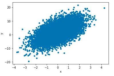
Scatter chart
plt =df.plot(kind='scatter',x='x', y='y')
The above code snippet plots the following chart:

Hexbin
plt =df.plot(kind='hexbin',x='x', bins='log',y='y')
For log function is used for creating bins. The chart looks like the following screenshot:

The deeper the color, the higher the density.