This article provides examples about plotting area chart using pandas.DataFrame.plot or pandas.core.groupby.DataFrameGroupBy.plot function.
Prerequisites
The data I'm going to use is the same as the other article Pandas DataFrame Plot - Bar Chart. I'm also using Jupyter Notebook to plot them.
The DataFrame has 9 records:
| DATE | TYPE | SALES |
|---|---|---|
| 0 | 2020-01-01 | TypeA |
| --- | --- | --- |
| 1 | 2020-01-01 | TypeB |
| --- | --- | --- |
| 2 | 2020-01-01 | TypeC |
| --- | --- | --- |
| 3 | 2020-02-01 | TypeA |
| --- | --- | --- |
| 4 | 2020-02-01 | TypeB |
| --- | --- | --- |
| 5 | 2020-02-01 | TypeC |
| --- | --- | --- |
| 6 | 2020-03-01 | TypeA |
| --- | --- | --- |
| 7 | 2020-03-01 | TypeB |
| --- | --- | --- |
| 8 | 2020-03-01 | TypeC |
| --- | --- | --- |
Stacked area chart
import matplotlib
import matplotlib.dates as mdates
from matplotlib.dates import DateFormatter

df_unstack = df.groupby(['DATE','TYPE']).sum().unstack()
plt =df_unstack.plot(kind='area',y='SALES', stacked = True)

date_form = DateFormatter("%Y-%m")
plt.xaxis.set_major_formatter(date_form)
plt.xaxis.set_major_locator(mdates.MonthLocator(interval=1))
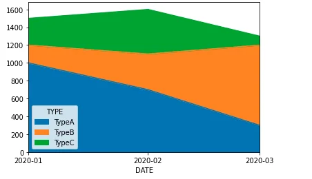
The above code snippet plots a stacked area chart as the following screenshot shows:

Similar as the bar or line chart examples, major locator and formatter are used to control the formats.
Cumulative stacked area chart
import matplotlib
import matplotlib.dates as mdates
from matplotlib.dates import DateFormatter

df_unstack = df.groupby(['DATE','TYPE']).sum().groupby(level=[1]).cumsum().unstack()
plt =df_unstack.plot(kind='area',y='SALES', stacked = True, figsize=[10,5])

date_form = DateFormatter("%Y-%m")
plt.xaxis.set_major_formatter(date_form)
plt.xaxis.set_major_locator(mdates.MonthLocator(interval=1))
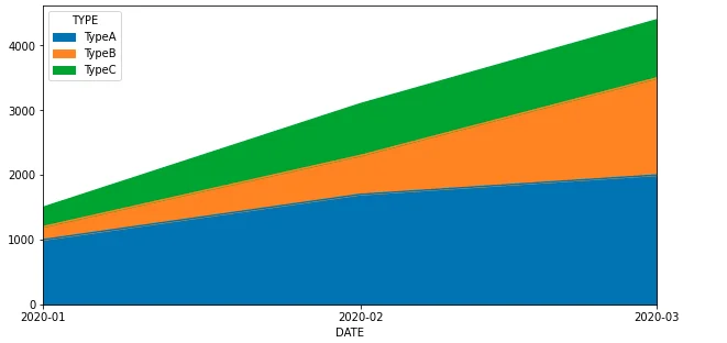
The chart looks like the following:
