In Plotting with R (Part I), I summarized the functions that can be used in R plotting. In this part, we continue the journey to plot more rich and complex charts like Pie Chart, Bar Chart, BoxPlot, Histogram, Line and Scatterplot using those functions.
Pie chart
Pie chart can be drawn using the following function:
pie(x, labels, radius, main, col, clockwise)
Pie chart with legends
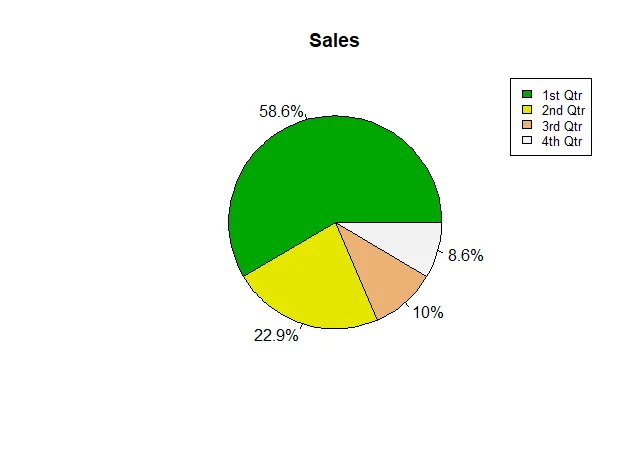
The following code snippet (script R28.PieChart.R) draws a pie chart with legends:
# Draw pie charts
(
  data <- data.frame(Quarter=c('1st Qtr','2nd Qtr', '3rd Qtr','4th Qtr'), Sales=c(8.2,3.2,1.4,1.2))
)

# create image device
#png(file="R28.PieChart.png")

# percentage calculation
percentage <- paste(as.character( round(data$Sales/sum(data$Sales)*100, 1)), "%", sep="")

# colors
colors <- terrain.colors(length(data$Sales))

# draw
pie(data$Sales, labels = percentage, main="Sales", col = colors)

# legends
legend("topright", legend = data$Quarter, cex=0.8, fill = colors)
The output looks like the following screenshot:
3D pie chart
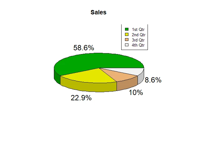
We can use package plotrixto draw 3D pie chart:
# 3D Chart

if("plotrix" %in% installed.packages())
{
  print("plotrix is installed.")
}else
{
  print("plotrix is not installed.")
  install.packages("plotrix")
}

require(plotrix)

pie3D(data$Sales, labels = percentage, main="Sales", col = colors)

# legends
legend("topright", legend = data$Quarter, cex=0.8, fill = colors)
The chart looks like this:
Bar chart
Bar chart can be drawn using the following function:
barplot(H, xlab, ylab, main, names.arg, col)
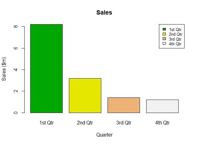
The following code snippets (script R29.BarChart.R) draws bar charts using this function with different parameter values.
Plot bar chart
# Draw bar charts

Quarter <- c('1st Qtr','2nd Qtr', '3rd Qtr','4th Qtr')

(
  data <- data.frame(Quarter=Quarter, Sales=c(8.2,3.2,1.4,1.2))
)

# colors
colors <- terrain.colors(length(data$Sales))

# draw
barplot(data$Sales, names.arg = data$Quarter, main="Sales", col = colors, xlab="Quarter", ylab="Sales ($m)")

# legends
legend("topright", legend = data$Quarter, cex=0.8, fill = colors)
The chart looks like the following:
Plot stacked bar chart
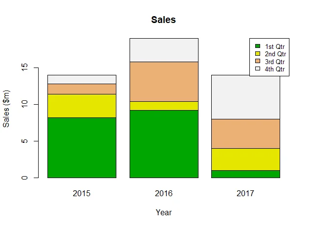
Matrix can be used as input for drawing stacked bar chart:
# Stacked bar chart
Year <- c(2015,2016,2017)

# Use matrix
(
data <- matrix(c(8.2,3.2,1.4,1.2,9.2,1.2,5.4,3.2,1,3,4,6), nrow=4, ncol = 3)
)

# draw
barplot(data, names.arg = Year, main="Sales", col = colors, xlab="Year", ylab="Sales ($m)")

# legends
legend("topright", legend = Quarter, cex=0.8, fill = colors)
The chart looks like the following screenshot:
Box chart
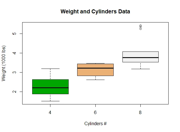
Boxplots are a measure of how well distributed is the data in a data set. It divides the data set into three quartiles. This graph represents the minimum, maximum, median, first quartile and third quartile in the data set. It is also useful in comparing the distribution of data across data sets by drawing boxplots for each of them.
BoxPlot can be drawn using the following function:
boxplot(x, data, notch, varwidth, names, main)
The following code snippet (script R30.BoxPlot.R) draw a boxplot chart with test data set:
# Box Plot

#A data frame with 32 observations on 11 variables.
#
#[, 1]	 mpg	 Miles/(US) gallon
#[, 2]	 cyl	 Number of cylinders
#[, 3]	 disp	 Displacement (cu.in.)
#[, 4]	 hp	 Gross horsepower
#[, 5]	 drat	 Rear axle ratio
#[, 6]	 wt	 Weight (1000 lbs)
#[, 7]	 qsec	 1/4 mile time
#[, 8]	 vs	 V/S
#[, 9]	 am	 Transmission (0 = automatic, 1 = manual)
#[,10]	 gear	 Number of forward gears
#[,11]	 carb	 Number of carburetors

# Plot the chart.
boxplot(wt ~ cyl, data = mtcars, xlab = "Cylinders #",
        ylab = "Weight (1000 lbs)", main = "Weight and Cylinders Data", col=terrain.colors( length(unique(mtcars$cyl))))
The chart looks like this screenshot:
Histogram chart
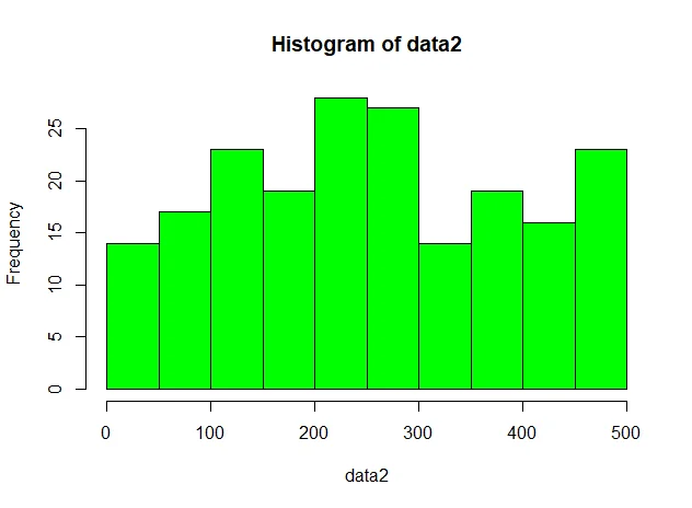
A histogram represents the frequencies of values of a variable bucketed into ranges. Histogram is similar to bar chat but the difference is it groups the values into continuous ranges. Each bar in histogram represents the height of the number of values present in that range.
Histogram can be drawn using the following function:
hist(v,main,xlab,xlim,ylim,breaks,col,border)
The following are two examples (script R31.Histogram.R) of plotting histogram using generated data (one via rnormand another via sample):
# Histogram
# prepare data
(
  data1 <- rnorm(200,mean=40,sd=10)
)
hist(data1, col=c("green"))

(
  data2 <- sample.int(500,200)
)
hist(data2, col=c("green"))
The charts look like the following two screenshots:
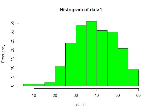
infoWe can tell from the chart that rnormdoes generate a sequence of data elements (variable) that aligns with normal distribution.
Line chart
Line can be drawn using the following functions:
plot()
lines()
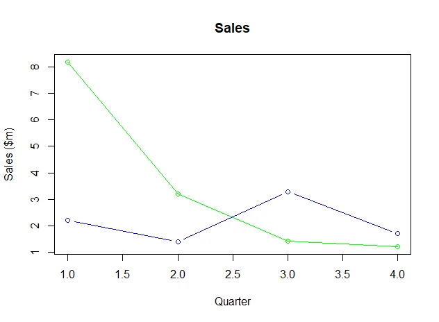
The following code snippet (script R32.Line.R) draws a simple line chart:
# Line chart
Quarter <- c('1st Qtr','2nd Qtr', '3rd Qtr','4th Qtr')
(
  data <- data.frame(Quarter=Quarter, Sales=c(8.2,3.2,1.4,1.2))
)
# colors
colors <- "green"

# draw
plot(data$Sales, main="Sales", col = colors, xlab="Quarter", ylab="Sales ($m)", type="o")

#another line
lines((1:4),rnorm(4,2,1), type="b", col="blue")
Scatter chart
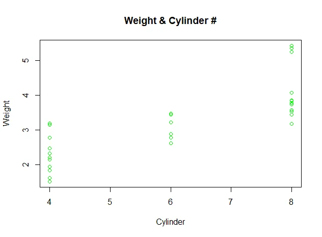
Scatterplots show many points plotted in the Cartesian plane. Each point represents the values of two variables. One variable is chosen in the horizontal axis and another in the vertical axis.
Scatterplot can be drawn using the following function:
plot(x, y, main, xlab, ylab, xlim, ylim, axes)
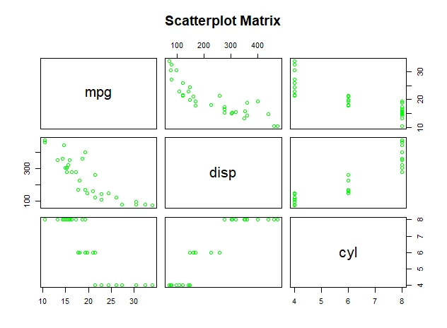
pairs() # create matrix of scatterplots.
The following code snippet (script R33.Scatterplot.R) shows how to use these two functions to draw Scatterplot:
# Scatterplot
plot(y = mtcars$wt,x = mtcars$cyl,
     xlab = "Cylinder",
     ylab = "Weight",
     ylim = range(mtcars$wt),
     xlim = range(mtcars$cyl),
     main = "Weight & Cylinder #",
     col="green"
)

# pairs
pairs(~mpg+disp+cyl,data = mtcars,
      main = "Scatterplot Matrix", col="green")
The charts look like the following screenshots:
Summary
There are many other charts that can be drawn in R. Refer to official documentation or help documents for more details.