In Bootstrap 5, card-column CSS class is removed and the recommended replacement is Masonry JavaScript library. An example is also provided: Masonry example · Bootstrap v5.1. This article will provides examples about dynamically call Masonry API in JavaScript instead of data attributes. I'll also provide some tips about adjust layout for cards with images.
infoPlease ignore the English grammar error in the examples. I didn't notice that until I was half way already.
Without Masonry
The following example just uses Bootstrap 5 responsive grid:
<!doctype html>
<html lang="en">

<head>
    <!-- Required meta tags -->
    <meta charset="utf-8">
    <meta name="viewport" content="width=device-width, initial-scale=1">
    <!-- Bootstrap CSS -->
    <link href="https://cdn.jsdelivr.net/npm/bootstrap@5.1.0/dist/css/bootstrap.min.css" rel="stylesheet"
        integrity="sha384-KyZXEAg3QhqLMpG8r+8fhAXLRk2vvoC2f3B09zVXn8CA5QIVfZOJ3BCsw2P0p/We" crossorigin="anonymous">
    <title>Bootstrap 5 with Masonry!</title>
</head>

<body>

    <div class="container py-5 mt-5">
        <h1>Bootstrap 5 with Masonry</h1>
        <div class="row row-cols-1 row-cols-md-3 g-4">
            <div class="col">
                <div class="card bg-primary">
                    <div class="card-body text-white">
                        <p style="height:200px;">This a text block A</p>
                    </div>
                </div>
            </div>
            <div class="col">
                <div class="card bg-secondary">
                    <div class="card-body text-white">This a text block B</div>
                </div>
            </div>
            <div class="col">
                <div class="card bg-success">
                    <div class="card-body text-white">
                        <p style="height:100px;">This a text block C</p>
                    </div>
                </div>
            </div>
            <div class="col">
                <div class="card bg-info">
                    <div class="card-body text-white">This a text block D</div>
                </div>
            </div>
            <div class="col">
                <div class="card bg-dark">
                    <div class="card-body text-white">This a text block E</div>
                </div>
            </div>
        </div>
    </div>

    <!-- Bootstrap Bundle with Popper -->
    <script src="https://cdn.jsdelivr.net/npm/bootstrap@5.1.0/dist/js/bootstrap.bundle.min.js"
        integrity="sha384-U1DAWAznBHeqEIlVSCgzq+c9gqGAJn5c/t99JyeKa9xxaYpSvHU5awsuZVVFIhvj"
        crossorigin="anonymous"></script>
    <!-- Masonry scripts-->
    <script src="https://unpkg.com/masonry-layout@4/dist/masonry.pkgd.min.js"></script>
</body>

</html>
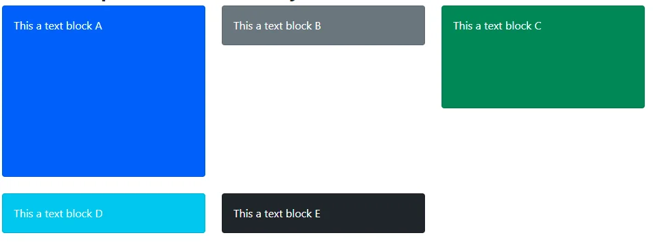
The page looks like the following screenshot:

There are many gaps as the blocks or cards are different in size. Now let's use Masonry to adjust the layout.
Use data attributes
The easiest way is to use data attributes. The previous example already includes reference to Masonry JavaScript library.
 <!-- Masonry scripts-->
    <script src="https://unpkg.com/masonry-layout@4/dist/masonry.pkgd.min.js"></script>
We just need to change the div element with .row class slightly to add data attributes like the following:
<div class="row row-cols-1 row-cols-md-3 g-4" data-masonry='{"percentPosition": true, "itemSelector": ".col" }'>
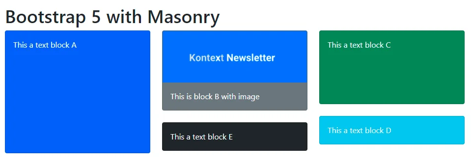
Refresh the page and it now looks like the following screenshot:

It looks much better.
Use JavaScript
In some scenarios, you may want to dynamically call Masonry APIs to adjust the layout. For example, displaying cards after calling APIs via Ajax. To implement that, simply add the following initialization after the Ajax call success handlers.
<!-- Masonry layout-->
    <script>
        var msnry = new Masonry('.row', {
            itemSelector: '.col',
            percentPosition: true
        });
    </script>
The rendered page is same as the example using data attribute.
Bootstrap card with image
It's quite straightforward when using Masonry with text cards. However if we change the above card B with an image, you may find something unexpected.
<div class="col">
                <div class="card bg-secondary">
                    <img src="/project/xml_xhtml_xslt_dhtml_css_javascript/resources/19E3F95E-D1A6-5AB8-9720-41F6D54E1B9F.webp" class="card-img-top" />
                    <div class="card-body text-white">This is block B with image</div>
                </div>
            </div>
The result now looks differently:

Block B is overlapping with others as the image is asynchronously loaded. There are several ways to address this issue:
Delay Masonry function calls
A typical solution many people provides is to delay Masonry function calls via setTimeoutfunction. The expectation is that if you call it multiple times the images will be loaded eventually. The drawback of this approach is also obvious - you won't know when exactly the images will be loaded and different users may have different experience. For example, a user with very slow internet speed might still notice the overlaps.
<!-- Masonry layout-->
    <script>
        var msnry = new Masonry('.row', {
            itemSelector: '.col',
            percentPosition: true
        });
        setTimeout(function () {
            msnry.layout();
        }, 100);

        setTimeout(function () {
            msnry.layout();
        }, 300);

        setTimeout(function () {
            msnry.layout();
        }, 1000);

        setTimeout(function () {
            msnry.layout();
        }, 5000);
    </script>
The above code snippet calls layout function 4 times. The result looks like the following screenshot:

The users can observe that block D jumps around between the second and the third columns while the image is being loaded.
Call layout function after each image is loaded
Another approach is to call layout after each image is loaded. This will guarantee that the layout will be adjusted after all the images are loaded.
<!-- Masonry layout-->
    <script>
        var $grid = document.querySelector('.row');
        var msnry = new Masonry($grid, {
            itemSelector: '.col',
            percentPosition: true
        });

        var $images = $grid.querySelectorAll('.card img');
        $images.forEach(function (el) {
            el.addEventListener('load', function () {
                console.log("Image is loaded: " + el.getAttribute("src"));
                msnry.layout();
            });
        });
    </script>
The drawback of this approach is that the layout function can be called as many times as your image count in the grid.
The result looks like exactly the same as the previous approach:
