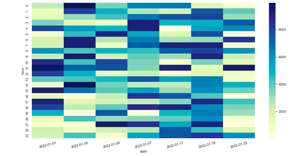
Heatmaps can be used to visualize data in a colored matrix. One typical use case is to visualize website clicks by date and hour. This article uses seaborn Python package to plot a heatmap chart. Jupyter notebook is used as the tool.
Import required packages
First, let's import the required packages:
import pandas as pd
import seaborn as sns
import matplotlib.pyplot as plt
from datetime import date, timedelta
import random
If seaborn package is not available in your Python environment, install it using the following command:
pip install seaborn
# or
pip3 install seaborn
If you are using Anaconda, you can directly add it into your Anaconda environment.
Create a sample DataFrame
Now let's create a DataFrame object in memory directly using code:
# Populate sample data
data= []
start_date = date(2022,1,1)
start_hour = 0
for i in range(0,7):
    start_date += timedelta(days=i)
    print(start_date)
    for j in range(0,24):
        clicks = random.randint(0, 10000)
        data.append({"date":start_date,"hour": j, "clicks": clicks})
df = pd.DataFrame(data)
df.reset_index(drop=True)
The prepared DataFrame looks like the following table:
| date | hour | clicks | |
|---|---|---|---|
| 0 | 2022-01-01 | 0 | 2517 |
| --- | --- | --- | --- |
| 1 | 2022-01-01 | 1 | 1242 |
| --- | --- | --- | --- |
| 2 | 2022-01-01 | 2 | 1428 |
| --- | --- | --- | --- |
| 3 | 2022-01-01 | 3 | 3495 |
| --- | --- | --- | --- |
| 4 | 2022-01-01 | 4 | 7880 |
| --- | --- | --- | --- |
| ... | ... | ... | ... |
| --- | --- | --- | --- |
| 163 | 2022-01-22 | 19 | 3025 |
| --- | --- | --- | --- |
| 164 | 2022-01-22 | 20 | 664 |
| --- | --- | --- | --- |
| 165 | 2022-01-22 | 21 | 71 |
| --- | --- | --- | --- |
| 166 | 2022-01-22 | 22 | 1603 |
| --- | --- | --- | --- |
| 167 | 2022-01-22 | 23 | 6141 |
| --- | --- | --- | --- |
168 rows × 3 columns
Visualize using seaborn
Now, convert the DataFrame to a pivot table for visualize:
df1 = df[['hour','date','clicks']]
x = pd.DataFrame(df1['date'].unique())
heatmap_pt = pd.pivot_table(df1,values ='clicks', index=['hour'], columns='date')
headmap_pt
The pivoted table can be used to plot the chart:
fig, ax = plt.subplots(figsize=(16,8))
sns.set()
sns.heatmap(heatmap_pt, cmap='YlGnBu')
plt.xticks(rotation=15)
plt.show()
The output looks like the following screenshot:

Seaborn can be used to plot many other different types of chart. Refer to seaborn: statistical data visualization for more details.